< Back to User Experience Design
Feature Functionality Optimization
THE PROBLEM
Our client’s analytics professionals made our team aware of an underperforming functionality crucial to our site’s patient journey. The feature allowed users to select a medical condition and then be taken to parts of the site that showed efficacy data. This content helped the audience understand what health outcomes they could expect from the cancer treatment touted by the site.
Our team had just one question to answer: How could we augment usability metrics while accelerating this user task, so that patients could more easily predict the health outcomes of their upcoming cancer treatment?
OUR CHALLENGE
How might we redesign the feature to improve its performance metrics and the site’s usability?
MY ROLE
• Design Thinking/Innovation Workshop Facilitator
• UX Strategist
• UX Design Lead
• UX Designer
DISCOVERY
Team legacy research discovery sessions
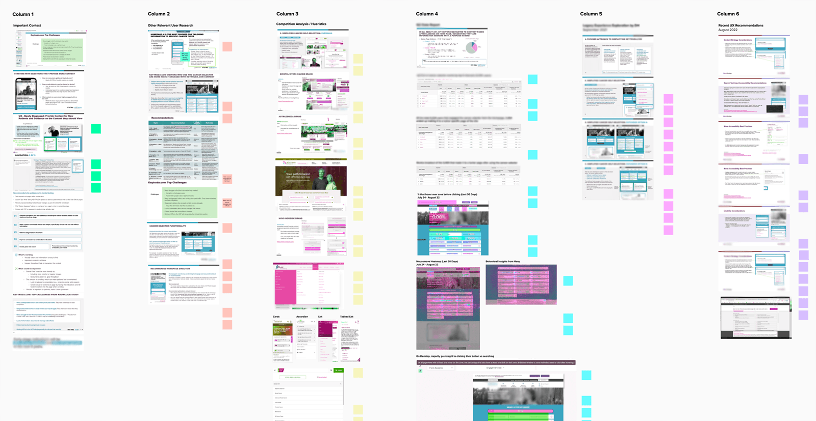
As part of a large discovery effort, important legacy research was placed on a white board, Each team member was given a column (matching the capabilities of their role within the team) to analyze and draw insights from. Those insights were gathered and grouped into categories. The categorized groups exposed the high-level opportunities where the experience could be improved.
Users needed to understand whether our branded medicine could treat their cancer, and if so, what the efficacy data could help them predict about their own health outcomes.
In order to access this content, users needed to select the precise cancer they were fighting from a list. After the selection, they’d be shuttled to the area of the site where the treatment’s clinical trial and efficacy data were presented.
Before we could improve the selection feature, our team would need to initiate a discovery effort across the full scope of the product’s legacy research so that we could understand the opportunities, pain points, and gaps that existed within this precise use case.
We divided forces to move fast, allowing each team member to focus on the research that best suited their role. The team quickly detected areas for improvement that would create positive impact.
UNDERSTANDING AREAS OF IMPACT
Weighing categories for improvement
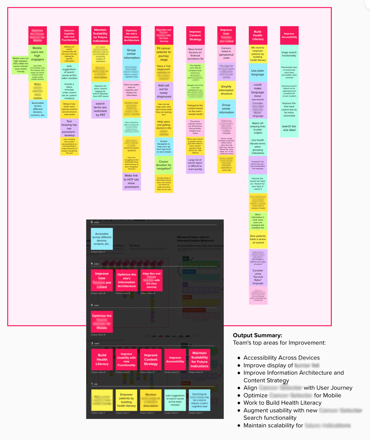
The team arranged each category of improvement opportunities into vertical columns, and ranked the items within each category by importance.
We then voted on which columns would make the most positive impact to the feature based on our collective knowledge of the product’s performance in-market.
We had formed a new, shared understanding of what improvement areas were perceived as valuable to pursue. Using this analysis, we set out to reframe the problem from a newly-informed team perspective.
NEW LIGHT
Reframing the problem
At this point, it was important to ensure that the team didn’t “miss the forest for the trees.” Before we continued our workshops, we needed to step back from the work, and run our team through an exercise that viewed the problem from a broader perspective.
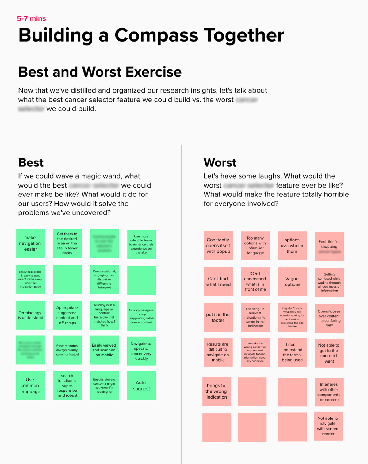
The Best and Worst Exercise is a great tool for doing just that. Team members are able to use impressions leftover from the research analysis to think about what would most impact the success or failure of the feature redesign.
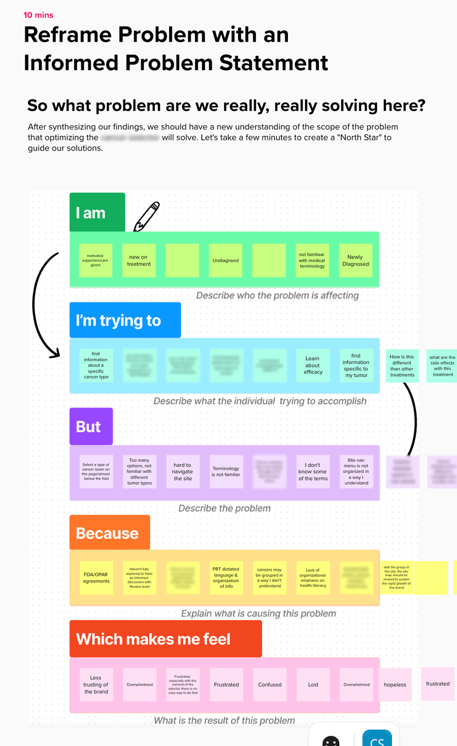
The team discussed the outcomes from the Best and Worst Exercise, and carried them into a Problem Reframing Workshop. During the course of this exercise, the team joined forces to more precisely define the problem context users were encountering while using the product’s feature. Together, our team worked to better understand the user, their task, and the specific impediments they were encountering.
The Best and Worst Exercise is a great way to get your team to slow down and focus on the the broader product context. This helps to create a general direction for improvement after forming a shared understanding during the team research synthesis. It also prevents the team from getting bogged down in the granular details that haven’t yet been informed by the team’s mission.
Reframing the user’s problem context from a research-informed perspective takes the team’s general direction and hones it into a precise path for ideating towards a successful solution.
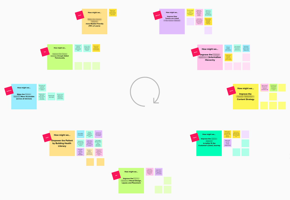
This How Might We Exercise allowed the team to take their new perspective, formed by a reframed problem statement, and brainstorm ideas for how to solve the users’ biggest issues with the feature’s functionality.
IDEATING SOLUTIONS
Ideating to Test and Learn
The How Might We Exercise is great for brainstorming efforts that can improve the product in areas discerned from prior workshops. Each group of stickies represents core areas of concern that our team knew needed to be addressed.
Team members worked together across multiple sessions to imagine solutions to the problems users were encountering within the feature’s functionality.
A PLAN FOR ACTION
Prioritization
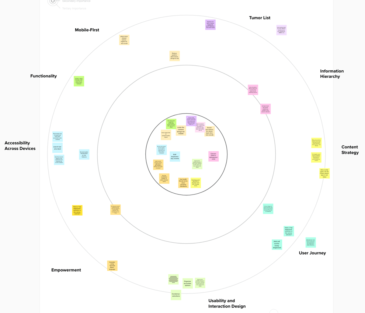
Our team plotted each viable solution from the How Might We ideation exercise on a Bullseye Prioritization graph. Solutions were placed in their respective positions based on the feature’s key areas for improvement.
The solutions that held the most promise for impact made their way to the middle of the bullseye. The team continued to move stickies into higher priority as a result of individual analysis and group discussion.
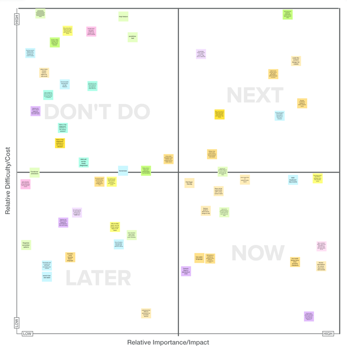
Then, our development team plotted each solution on a Feasibility Matrix to indicate which action items held the promise of yielding high impacts for low effort against the team’s capacity and timeline. Now, we could begin visually conceptualizing the functionality updates.
This Bulleye Prioritization Exercise allowed the team to decide what solutions from the ideation session had the highest likelihood of creating successful outputs.
The team’s developers helped us chart how difficult each solution would be, while we worked to determine their level-of-impact. Once each action item was plotted, we knew which solutions should be executed and which should be tabled.
LEARNING THROUGH AUDIENCE TESTING
Stress-testing for real-world learnings
After putting together wireframes, designs, and rough prototypes, our team took feature improvements into testing with the audience. Would the users understand the new functionality? Would they understand how we had categorized their options for interaction? Had we labeled the information in a way that would accurately match their expectations?
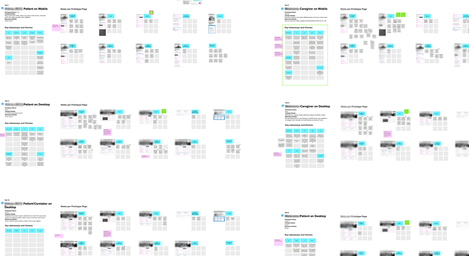
During extended usability research sessions, we recorded the key insights from each user. As a team, we discussed if and how each piece of feedback would be reflected within our new designs. Interestingly enough, we were able to uncover insights that would not only improve the feature, but also the product and brand messaging as a whole.
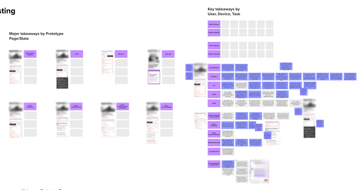
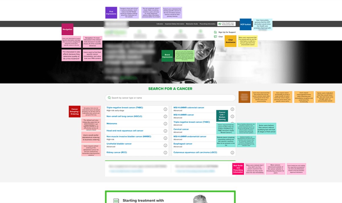
Pictured here is our team’s working synthesis board, where we painstakingly recorded significant findings from each user testing session. We then organized our learnings into usable insights.
Key takeaways to be included in the final build. Without this research, these invaluable insights would’ve gone undiscovered as missed opportunities for improvement. These takeaways would become our team’s North Star for enhancing the feature’s user interface elements.
Interestingly enough, important learnings were discovered for the rest of the product. Improvements included everything from brand messaging to issues with the website’s labeling and functionality. We socialized these insights to the rest of the group, allowing other teams to further improve upon the client’s other digital properties.
THE RESULT
Redesigning for Impact and Efficiency
The feature’s final redesign featured revamped functionality that allowed users to quickly reach the areas of the site where important information about their condition could be found.
Our team’s product design improvements included:
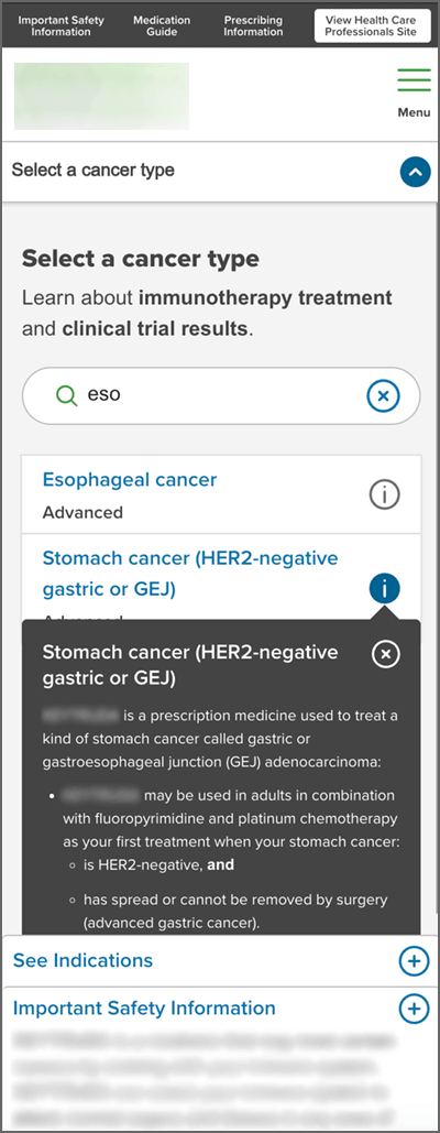
A robust search feature that makes useful content suggestions as the user types, eliminating content dead-ends and drop-offs.
Contextual tooltips that allowed users to quickly understand whether their condition could be treated by the medicine.
Eyebrows and condensed labeling that helped users scan and understand the functionality at-a-glance.
The proper affordances from the design system (that we built and documented concurrently) to accurately communicate the feature’s state at all times.
Condensed and shortened body copy with bolding to speed comprehension.
As a result, the audience was able to find information about their specific medical condition much more quickly, and their time-on-task (reaching treatment efficacy information) metrics were impacted significantly for the better. Our team’s efforts for improvement had been a success.
The new designed featured streamlined elements for accelerated use and handled errors intelligently with relevant content suggestions.
REFLECTIONS
Whenever poor metrics compel a team to improve a feature, they’re often tempted to implement knee-jerk solutions. Things that have always bothered them about the feature quickly find themselves placed on an unintentional list of improvements. Teams execute on the list, and the effort continues, though divorced from the opportunity cost of fixing problems that may be doing the most harm.
That’s why research and testing are so important. Improvements that would’ve moved the needle go undiscovered when teams do not synthesize learnings to find the true impediments to success. Ultimately, vague assumptions usually get blamed for the metrics that didn’t improve, and everyone moves on to make the same mistakes somewhere else. Teams rinse and repeat, and over time begin touting milestones met instead of actual success metrics.
The relationship between the user’s problem and our client’s revenue must be a tangible metric that we can improve upon. Without the kind of workshops shown above, its impossible for a team to know whether they are moving toward success or just fulfilling the stated business objectives absent of profitable goals. In other words, we must look at the features we build as being in service to improving the KPIs that affect our organization’s bottom line. And because the user’s success is tied to our own, we must be serious about defining the impact of our team’s endeavors before they are endured. Otherwise, how would we create anything meaningful?
Learnings and Takeaways
A fully considered exploration of legacy and current user research is important for your team’s ability to understand the product context. Without this synthesis, it is impossible to know what improvements to make and how to prioritize them. Taking time to understand the real-world value of taking an action often clarifies its priority.
Team workshops expose ideas that would’ve otherwise gone unnoticed. Group discussion and workshops create a confluence of these ideas, resulting in impactful design concepts.
Building prototypes from wireframes is essential for performing user testing sessions. Your team must observe each test, as third parties may miss findings important to your product’s context.
Users must be given content on-ramps for unsuccessful searches and feature error states. This will prevent experience dead-ends and growing abandonment rates.
Contextual aids help educate users in the exact moment that they encounter new or difficult information, and help maintain your users’ momentum as they progress through the experience.
Ensure that your copy and labeling work to pull your audience through the experience by enhancing their ability to scan the content, instead of bogging them down in confusing or difficult reading.
Fully documenting your feature improvements into the product’s design system while you work ensures proper implementation and helps inform team members that may pick up the work at a later date.
